

Portland, OR
Portland, OR
This is such a successful integration of all areas of design. It's what we all strive for – the graphics, the interior space itself, and respect for the whole building.
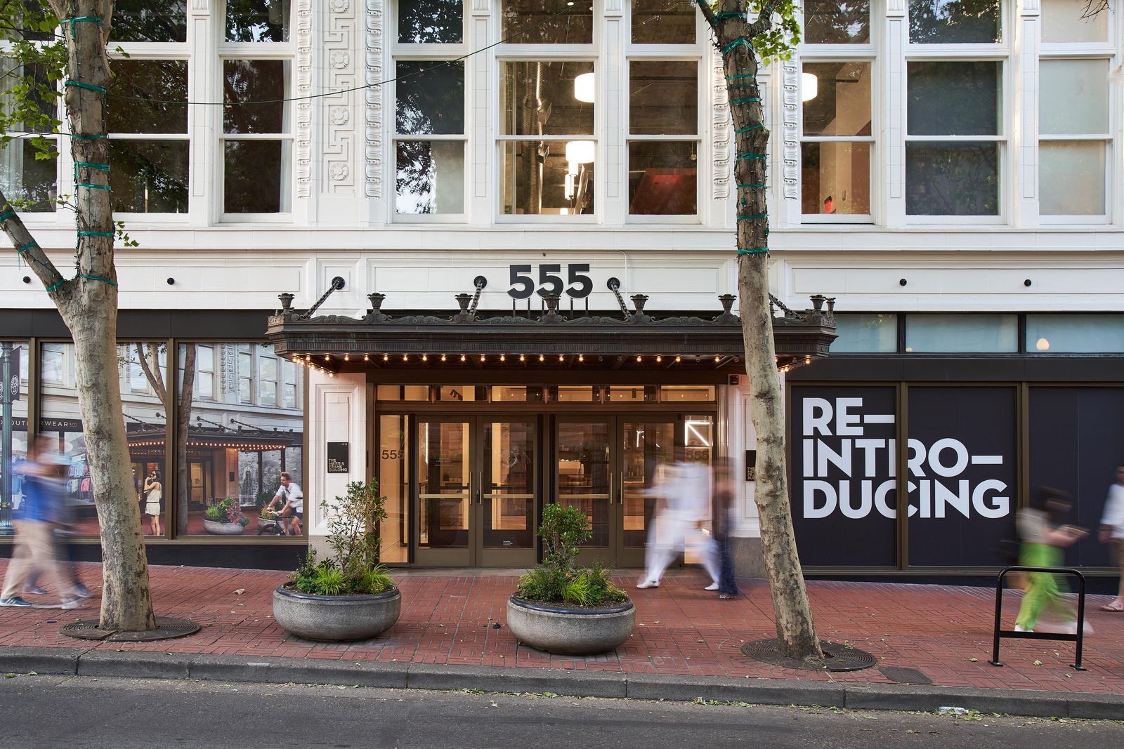
The Meier and Frank Building is a landmark centered in Portland’s urban core. Acknowledging the cultural importance and nostalgia felt for it was at the forefront of our design approach in transitioning the first five floors into amenity-rich, creative office and active retail spaces.
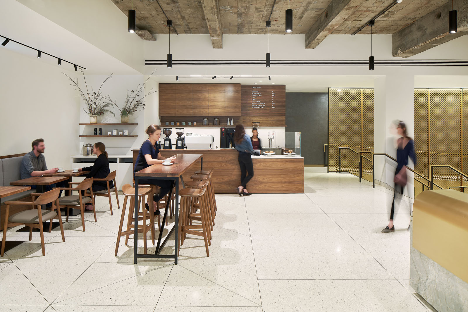
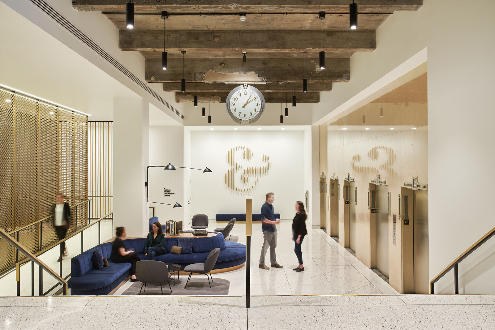
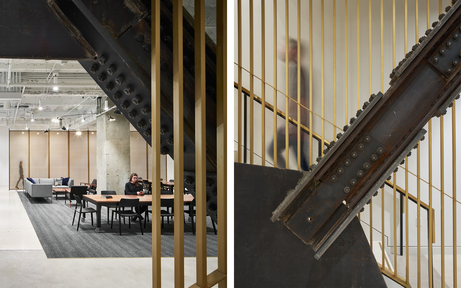
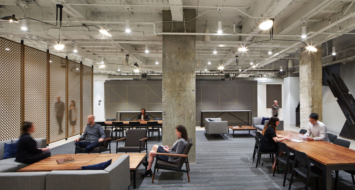
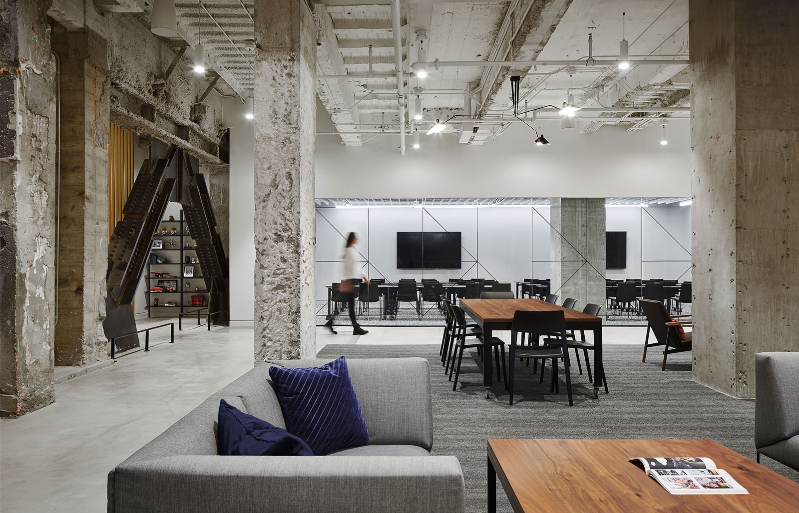
We drew upon the building’s rich exterior character to create modern spaces that are era-appropriate, rooted in Portland’s distinctive historic context. Terrazzo, stone, plaster, brass, and walnut elements are featured alongside authentic and patched terrazzo, exposed concrete ceilings, and re-discovered stone elevator fronts. Department store shoppers had long used the building’s historic clock as a meeting place, popularizing the phrase “Meet me under the clock.” This clock was incorporated as a central feature of the renovated lobby and still marks a place for people to meet.
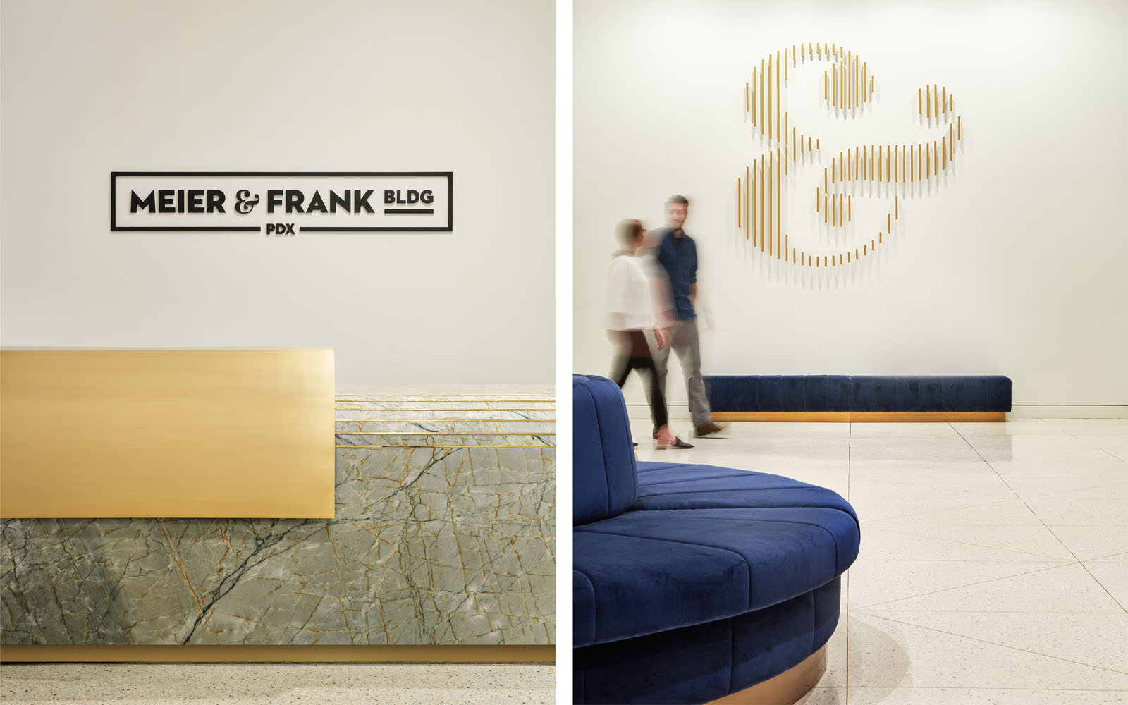
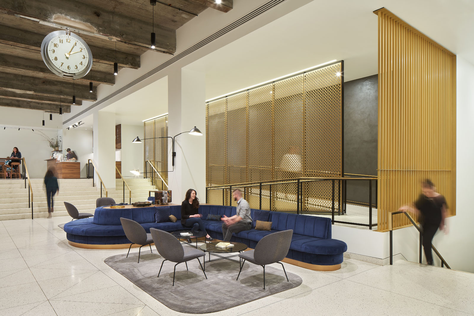
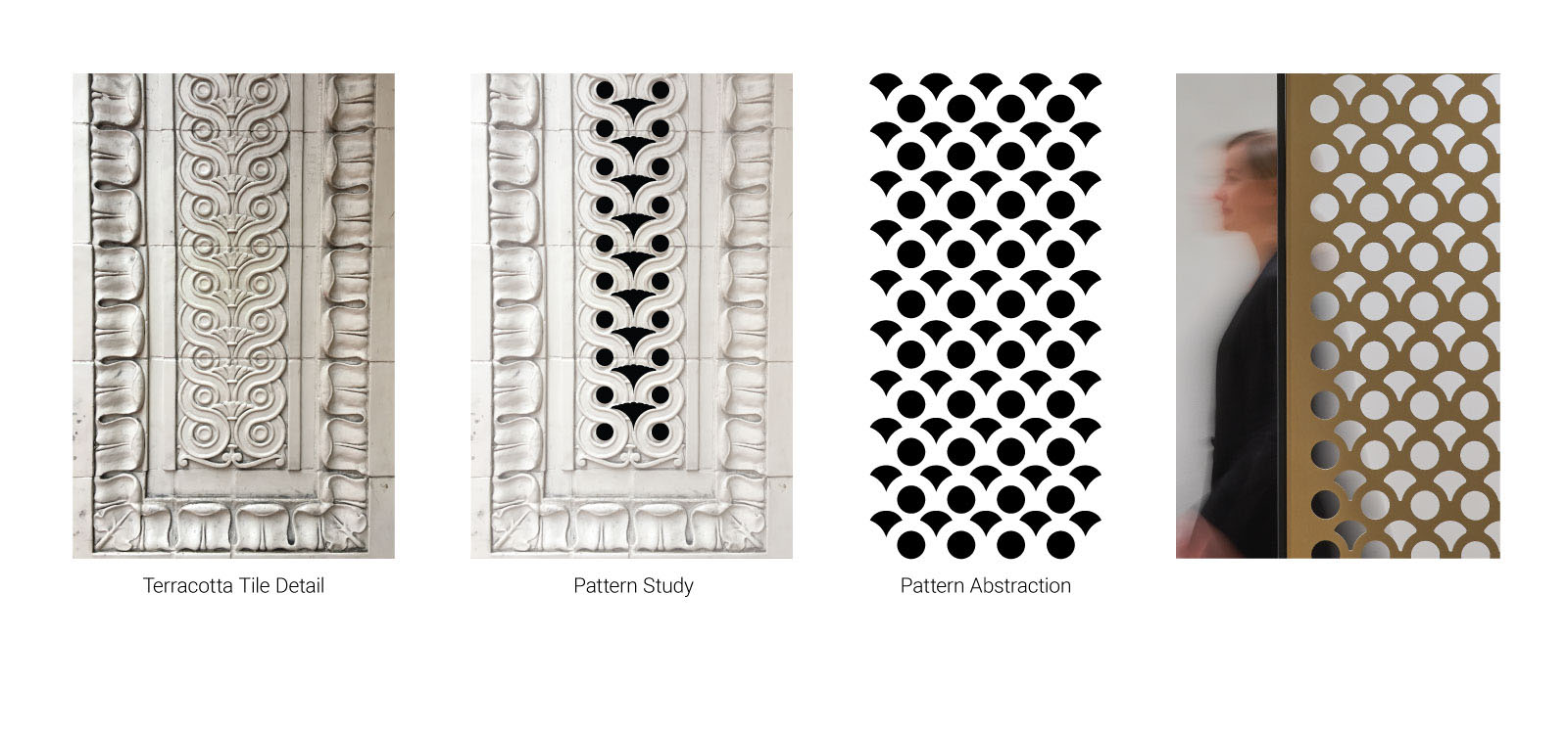
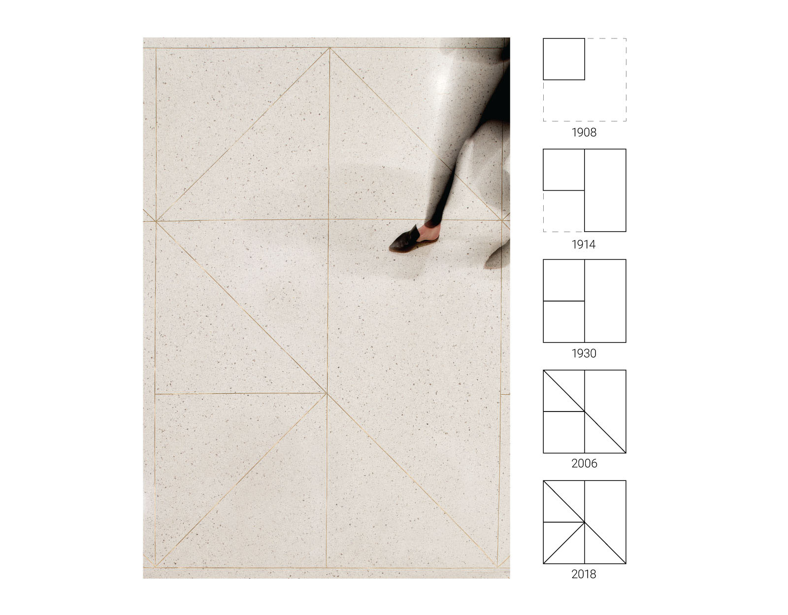
We also honored the building’s history through referential patterns expressed through brass details. Terrazzo inlays illustrate phases of the building’s construction and renovations over time, and the perforated screen presents a simplified abstraction of a relief found on the building’s terracotta tile cladding. The building’s repositioned brand was then overlaid through wayfinding and feature elements.
A lobby coffee shop serves as an amenity to tenants, with its modern lines and walnut graining differentiating its operation within the space. A lush, deep blue 45-foot-long sofa anchors the lobby’s central gathering space, while a basement amenities level supports tenants with a multi-use lounge, a large meeting room, a bike room and robust fitness facilities.
The historic use of the building as a department store resulted in internally focused floorplates that were ringed with stock rooms and window displays. To support the transformation to small-scale retail and office spaces, we opened the perimeter to daylight and re-engaged two historic mid-block entries. Each new entry is marked by a steel and glass canopy, scaled and simply detailed to be respectful of the building’s ornate character.
Size
200,000 sf core renovation; 23,000 sf interior renovation
Recognitions
LEED Silver (Core + Shell)
AIA Oregon 2020 Architecture Awards, Citation Award
IIDA Oregon 2019 Design Excellence Awards, Corporate Best in Category
IIDA Oregon 2019 Design Excellence Awards, Juror’s Choice
Collaborators
Turner Construction
PAE
KPFF
Peter Meijer Architect
O- Lighting Design
Arktura
Made Studio
Absolute Procurement