

06.08.21
A Logo to Showcase the Fine Arts Community
The Robbie & Lynore Robinson Fine Arts Center, designed by Bora, provides gallery, theater, performance, and rehearsal spaces for middle and high school students participating in arts programs within the Plano Independent School District. After successful collaboration in the design of the building, Plano ISD enlisted Bora’s experiential graphic design team to create a logo that would serve as a cornerstone of the Robinson Fine Arts Center brand.
The Process
At the beginning of every design project, we develop a set of design principles based on conversations with the client and our own research. These principles help everyone judge the creative work based on the same criteria. For the Robinson Fine Arts Center, four key principles drove our design decisions:
Form matches function: The logo should align with the intent of the building.
Physical center: The logo should consider the physical place of the building at the center of the district.
Symbolic center: The logo should consider the building’s role in bringing a diverse range of arts from various schools in the community together.
Recognizable forms: The logo should incorporate recognizable architectural features of the building.
After extensive exploration, we presented the client with a mix of logo options that showed a range of formality and expression. This first round of design included a solution that was derived directly from their initial requests, and other options that were an unexpected approach to implementing our four design principles.
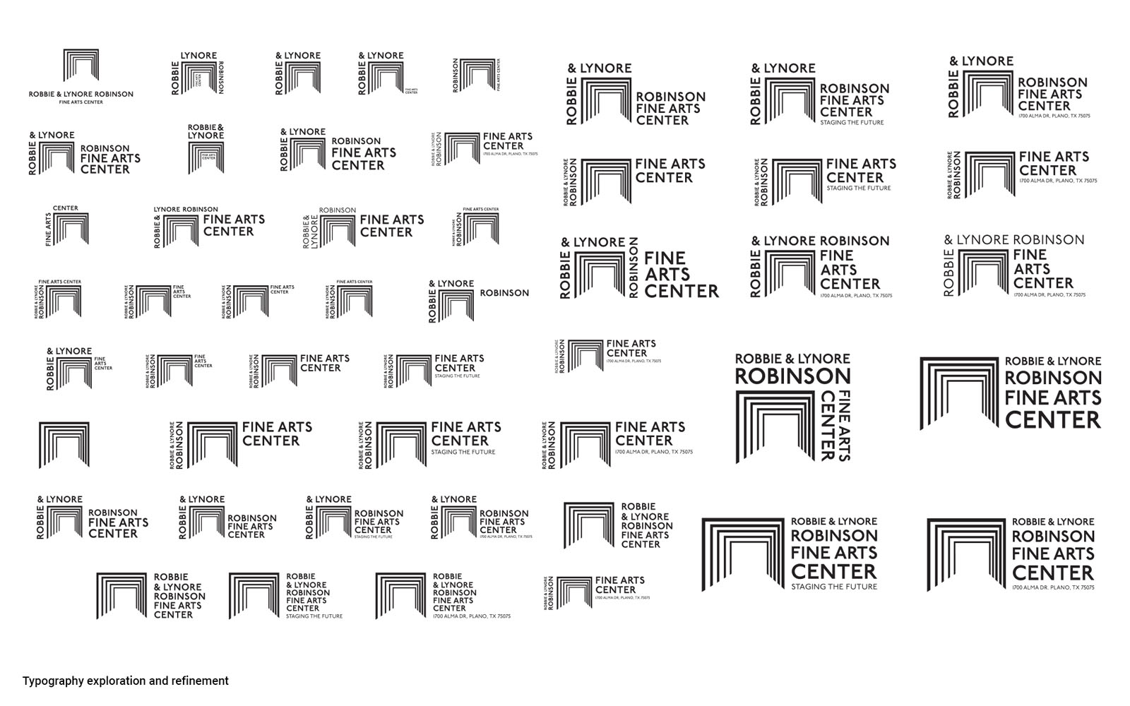
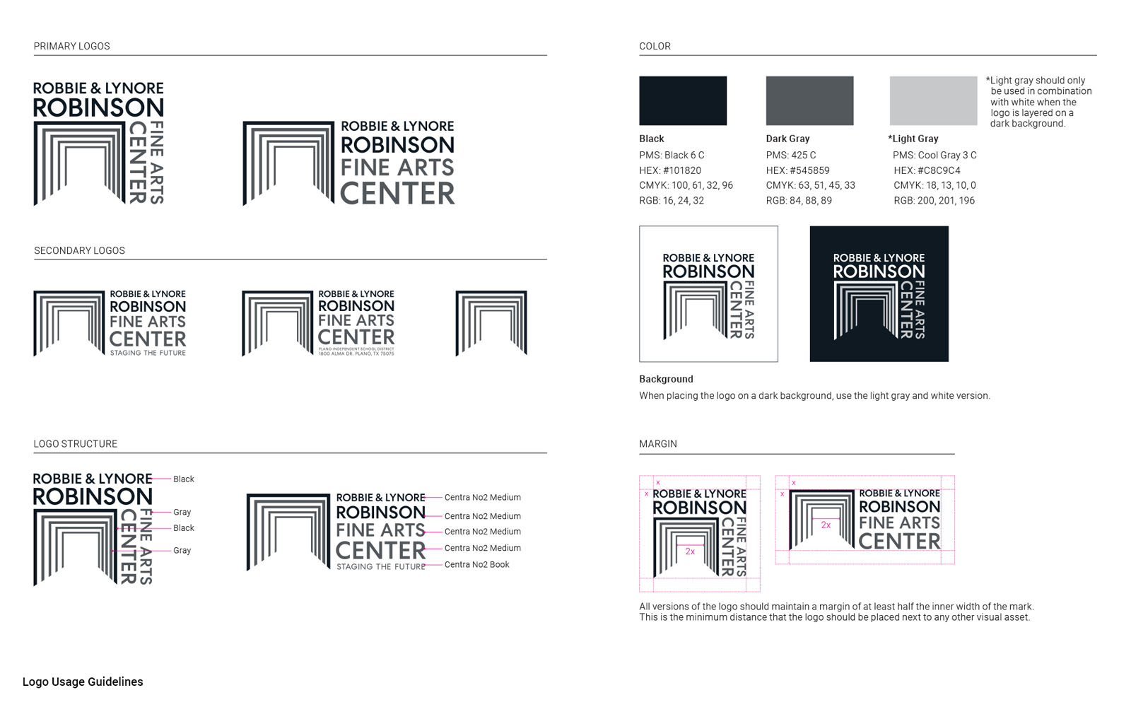
We then narrowed our focus to a single logo, exploring typography and color. We carefully assessed the various ways the logo would need to function when paired with additional lines of text, while also considering color options that would not compete or unintentionally show bias towards any of the feeder schools’ colors that participate in the Plano ISD fine arts programs.
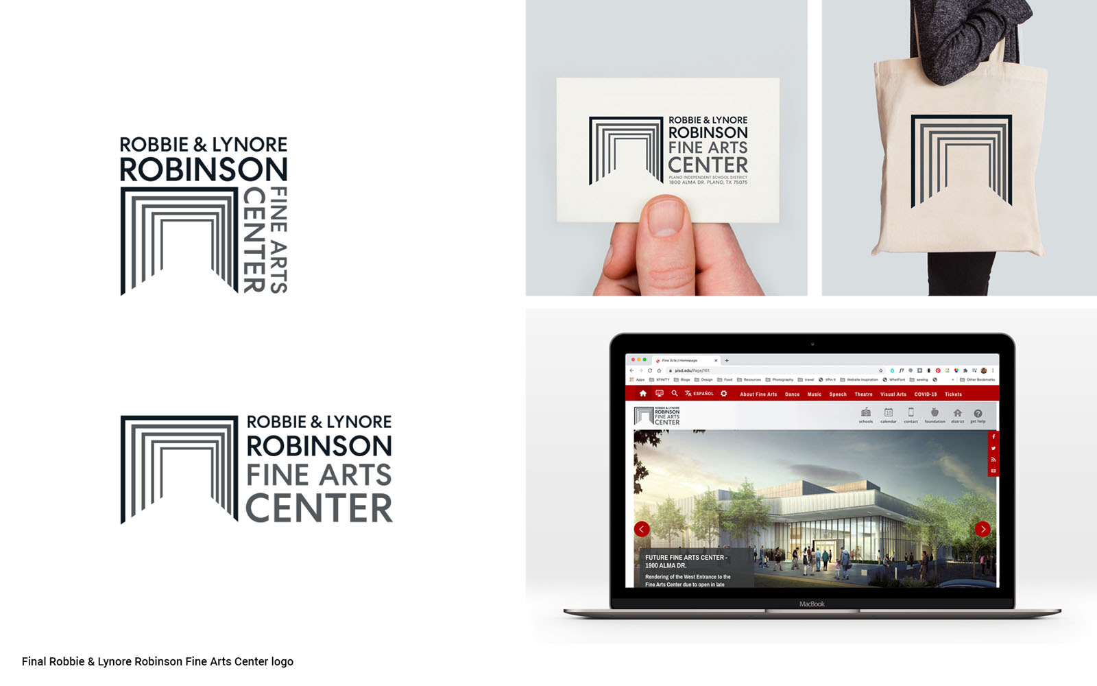
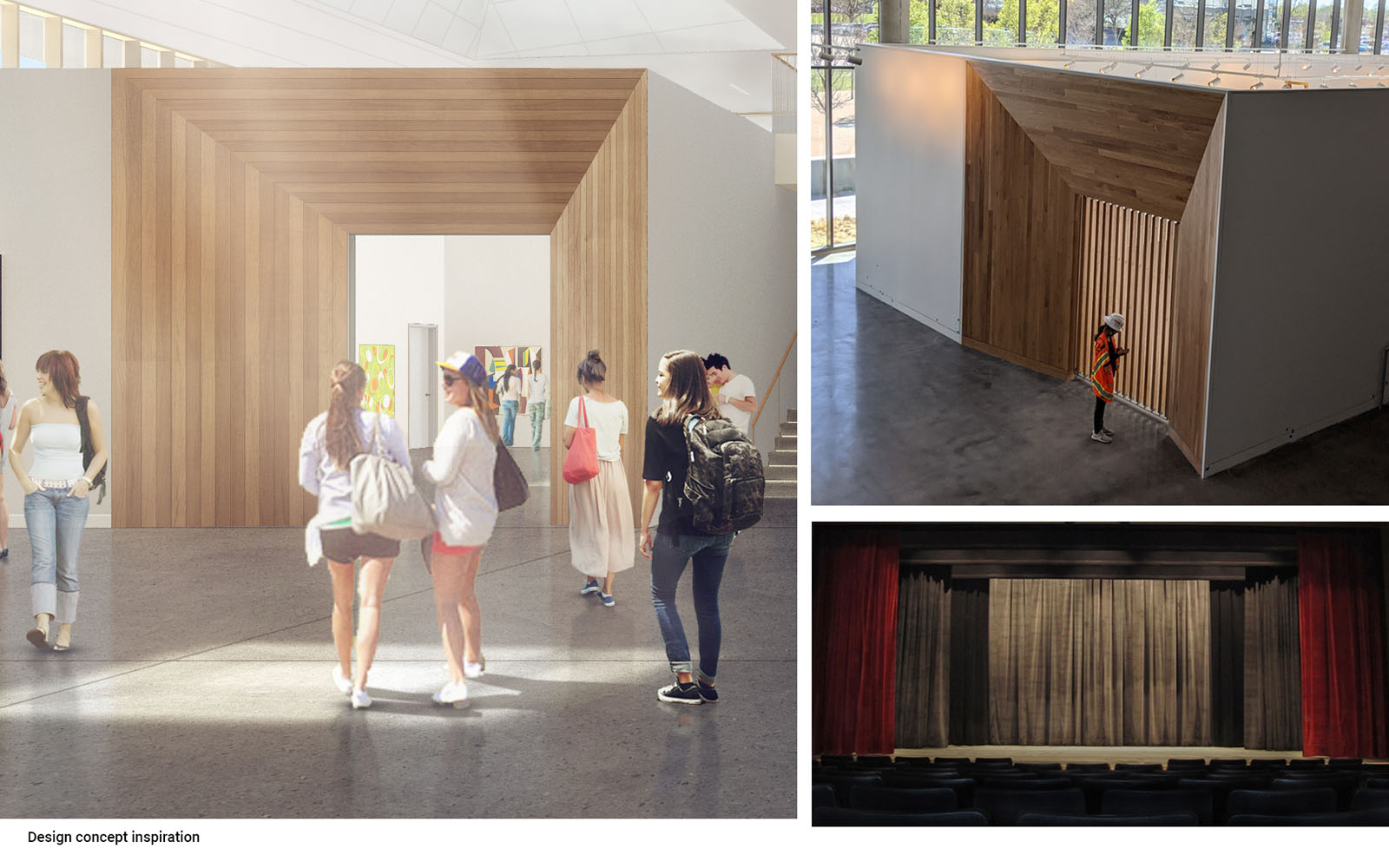
The chosen logo concept was inspired by the building’s dramatic wood entrances to the gallery and theater spaces. The mark’s repeated form symbolizes the amplification experienced during a performance on stage or through art hung on a wall, while the perspective—intentionally off-center—celebrates the diverse perspectives and boundaries pushed within the study of fine arts. Utilizing a strong black, white, and gray color palette allows the logo to complement any of the Plano ISD feeder schools’ colors.
Carrying Design Thinking from Architecture to Logo
Developing an identity for the Robinson Fine Arts Center that would further support the goals of the building was important for Bora and our client partners. By continuing the collaboration with the Plano ISD faculty and engaging the Bora graphic design team to bring in additional perspective, we shaped an identity that aligned with the project’s initial design principles, producing a logo that connects the Center’s physical space to its intrinsic values. This creative effort supports a consistent brand story at all scales while reinforcing a message of inclusion and celebration of the arts.